The Chris
Misterek
System
A complete web design framework built from five core skills: typography, layout, color, code, and conversion. Every rule on this page demonstrates the system it describes.
Type Scale System
The Major Third scale (1.25×) creates a predictable, harmonious hierarchy. Starting at 16px, each level is exactly 1.25× the previous — giving you intentional typography without guesswork.
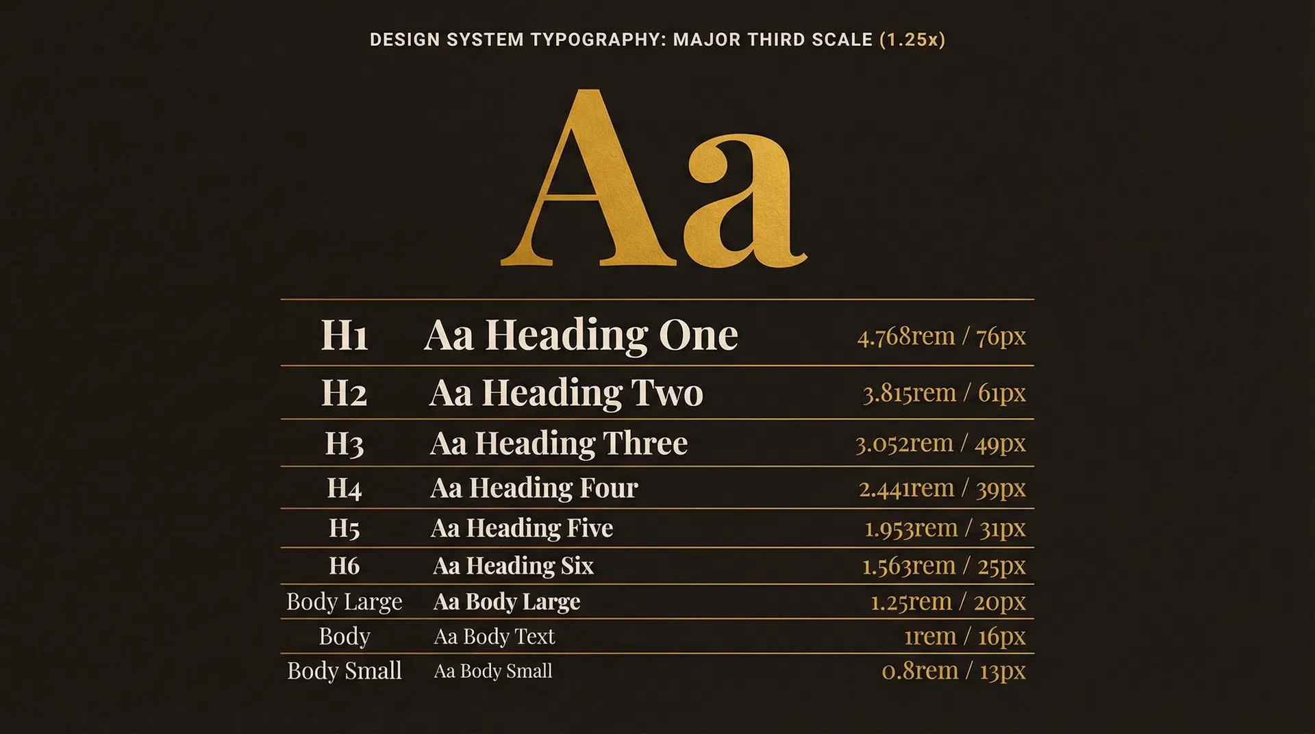
| Level | Sample | Size (REM) | Size (PX) | Weight | Line Height |
|---|---|---|---|---|---|
| H1 | Display Heading | 4.768rem | 76px | 900 | 1.05 |
| H2 | Section Title | 3.815rem | 61px | 700 | 1.1 |
| H3 | Sub-Section | 3.052rem | 49px | 700 | 1.15 |
| H4 | Card Heading | 2.441rem | 39px | 700 | 1.2 |
| H5 | Component Title | 1.953rem | 31px | 700 | 1.25 |
| H6 | Small Heading | 1.563rem | 25px | 700 | 1.3 |
| Body LG | Lead paragraph text for introductions | 1.25rem | 20px | 400 | 1.6 |
| Body | Standard paragraph text for main content | 1rem | 16px | 400 | 1.6 |
| Body SM | Caption and supporting text | 0.8rem | 13px | 400 | 1.5 |
Grid, Spacing & Hierarchy
Pro designers don't guess where things go. They use three systems: a grid for structure, an 8-point spacing system for rhythm, and visual hierarchy to guide the eye.
The Column Grid
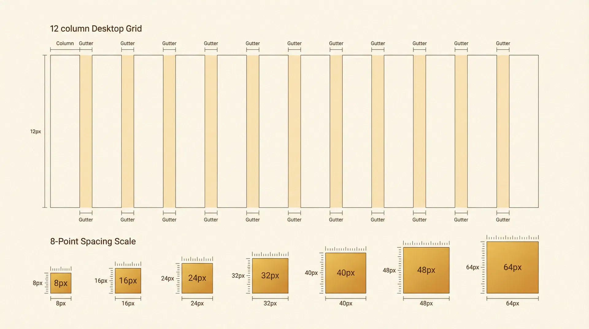
8-Point Grid System
All spacing is a multiple of 8. Used by Google Material Design and Apple HIG. Consistent rhythm, every time.
Visual Hierarchy Principles
Keep related elements close together. Grouping signals relationship.
Larger elements signal greater importance. Use the type scale to enforce this.
Use weight, color, or opacity to differentiate importance levels.
Clean lines create structure. Consistent alignment builds trust.
Color System
Pro designers don't use more color — they use color more intentionally. Limit your palette, assign each color a job, and use opacity to create depth without adding new hues.
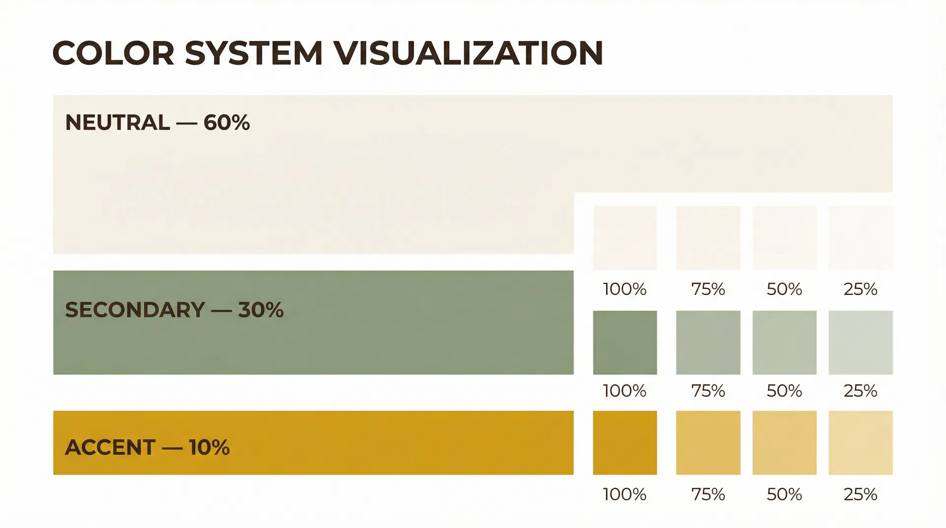
The 60 – 30 – 10 Rule
Neutral — 60%
Backgrounds and primary text. The canvas of your design.
Secondary — 30%
Cards, headers, alternate backgrounds. Supports without distracting.
Accent — 10%
Buttons, CTAs, highlights. Use sparingly for maximum impact.
Opacity Instead of More Colors
One good color used at different opacities beats five random colors. This technique, used by Google's Material Design, creates depth and hierarchy without expanding your palette.
Contrast Requirements (WCAG)
Functionality & Conversion
Most designers design for looks. Pro designers design for action. A beautiful site that doesn't convert is a failed site. These are the rules that bridge design and results.
CTA Placement Blueprint
A strategic CTA map ensures users always have a clear next action, no matter where they are on the page.
The Chris System in JSONC
The complete system defined as a JSONC configuration file. Use this as a starting point for any project — it encodes every rule, ratio, and decision into a portable, readable format.
{ // ============================================================ // THE CHRIS MISTEREK DESIGN SYSTEM — JSONC Configuration // Version: 1.0.0 // Based on: "5 Web Design Skills That Actually Matter" // ============================================================ "$schema": "chris-misterek-system/v1", "name": "Chris Misterek System", "version": "1.0.0", // ────────────────────────────────────────────────────────── // TYPOGRAPHY // ────────────────────────────────────────────────────────── "typography": { "fonts": { "display": { "family": "Playfair Display", "fallback": "Georgia, serif", "source": "Google Fonts", "weights": [700, 900], "usage": "H1–H3, hero text, editorial headings" }, "body": { "family": "Lato", "fallback": "system-ui, sans-serif", "source": "Google Fonts", "weights": [300, 400, 700], "usage": "Paragraphs, UI labels, navigation" }, "mono": { "family": "Space Mono", "fallback": "Courier New, monospace", "source": "Google Fonts", "weights": [400, 700], "usage": "Code, JSONC, technical labels, tags" } }, // Major Third Scale (1.25x ratio from 16px base) "scale": { "ratio": 1.25, "ratioName": "Major Third", "baseSize": "1rem", "basePx": 16, "tool": "https://typescale.com", "units": "rem", "levels": { "xs": { "rem": "0.64rem", "px": 10 }, "sm": { "rem": "0.8rem", "px": 13 }, "base": { "rem": "1rem", "px": 16 }, "lg": { "rem": "1.25rem", "px": 20 }, "xl": { "rem": "1.563rem", "px": 25 }, "2xl": { "rem": "1.953rem", "px": 31 }, "3xl": { "rem": "2.441rem", "px": 39 }, "4xl": { "rem": "3.052rem", "px": 49 }, "5xl": { "rem": "3.815rem", "px": 61 }, "6xl": { "rem": "4.768rem", "px": 76 } } }, "lineHeight": { "body": 1.5, "bodyLarge": 1.6, "headingTight": 1.05, "headingNormal": 1.15, "headingRelaxed": 1.3 }, "letterSpacing": { "body": "0", "headingLarge": "-0.03em", "headingMedium": "-0.02em", "headingSmall": "-0.01em", "label": "0.08em", "mono": "0.05em" } }, // ────────────────────────────────────────────────────────── // LAYOUT // ────────────────────────────────────────────────────────── "layout": { "grid": { "desktop": { "columns": 12, "gutter": "24px", "margin": "32px" }, "tablet": { "columns": 8, "gutter": "16px", "margin": "24px" }, "mobile": { "columns": 4, "gutter": "16px", "margin": "16px" } }, "spacing": { "unit": 8, "scale": [8, 16, 24, 32, 40, 48, 64, 80, 96, 128, 160], "rule": "All spacing values MUST be multiples of 8" }, "visualHierarchy": { "principles": ["proximity", "size", "contrast", "alignment"] }, "breakpoints": { "mobile": "< 640px", "tablet": "640px – 1024px", "desktop": "> 1024px" } }, // ────────────────────────────────────────────────────────── // COLOR // ────────────────────────────────────────────────────────── "color": { "distribution": { "neutral": { "percentage": 60, "role": "Background and primary text" }, "secondary": { "percentage": 30, "role": "Cards, sections, supporting elements" }, "accent": { "percentage": 10, "role": "CTAs, buttons, highlights" } }, "palette": { "neutral": { "cream": "#FAF8F4", "creamDark": "#F0EDE6", "espresso": "#1C1410", "espressoLight": "#3D2B1F" }, "secondary": { "sage": "#8B9E7E", "sageLight": "#A8BA9C", "sageDark": "#6B7E5E" }, "accent": { "amber": "#D4A017", "amberLight": "#E8B830" } }, "opacityScale": [100, 75, 50, 25, 10], "opacityRule": "Prefer opacity variations of existing colors over adding new hues", "contrast": { "normalText": { "minRatio": 4.5, "standard": "WCAG AA" }, "largeText": { "minRatio": 3.0, "standard": "WCAG AA" }, "uiComponents": { "minRatio": 3.0, "standard": "WCAG AA" } } }, // ────────────────────────────────────────────────────────── // CONVERSION & FUNCTIONALITY // ────────────────────────────────────────────────────────── "conversion": { "pageGoal": { "rule": "One goal per page — never more", "examples": ["Buy product", "Book a call", "Download lead magnet"] }, "ctaPlacement": [ { "zone": "Navigation", "type": "primary", "required": true }, { "zone": "Hero Section", "type": "primary", "required": true }, { "zone": "Every 2-3 sections", "type": "contextual", "required": true } ], "trustSignals": ["testimonials", "reviews", "social-proof", "case-studies"], "userJourney": { "know": "Brand awareness — they recognize you", "like": "Affinity — they connect with your values", "trust": "Credibility — social proof, results, clarity", "feel": "Emotion — they see themselves in your story" } }, // ────────────────────────────────────────────────────────── // IMPLEMENTATION PLAN // ────────────────────────────────────────────────────────── "implementation": { "phase1": "Set up typography: choose fonts, configure type scale in CSS custom properties", "phase2": "Configure grid: set up 12/8/4 column system in Figma or CSS Grid", "phase3": "Define spacing: create CSS variables for 8pt scale", "phase4": "Build color system: define palette, assign 60/30/10 roles, create opacity variants", "phase5": "Map user journey: define page goal, CTA placements, trust signal strategy", "phase6": "Audit and iterate: check contrast ratios, test hierarchy, validate conversion path" }}
While JSONC is excellent for documentation and tooling integration, the most practical implementation is to use CSS Custom Properties (Design Tokens) directly in your stylesheet. This gives you live inheritance, cascade support, and zero build-step overhead. For team environments, consider the W3C Design Tokens Format (DTCG) which uses a standardized JSON schema with $value, $type, and $description fields — compatible with Style Dictionary, Tokens Studio for Figma, and other tooling.